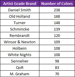
If you ask 100 artists what colors you should have in your palette, you will get 103 different responses. (Three of those artists will change their minds and swap a color at the last second!) Walk into any artists’ supply store and you will be confronted by an endless aisle hosting a mind-boggling mass of brands and colors. Turner sells 148 different colors, Old Holland offers 168, and Daniel Smith has a whopping 238 colors! SO MANY CHOICES! For beginners — and beyonders — it can be overwhelming.
Some artists recommend using only three colors – the primaries, Blue, Red, and Yellow. They suggest you mix your own colors. I also assume these artists do not use microwaves, refrigerators, or other modern conveniences, and they bake their own bread. ? Why buy bread when you can bake it yourself?
I am not that minimalistic with colors (though I do I bake my own bread). But I think it’s important to…
o KEEP
o IT
o SIMPLE
Having a few more than three colors can be helpful. But having too many can cause confusion, create disharmonious paintings, and possibly discourage you. Here is what I recommend:
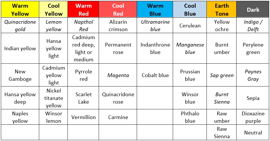
Choose a warm and cool of each of the primary colors, a few earth tones, and a dark color.
That’s it! These are my colors of choice. The ones in italics are my Must Haves, the colors that I can’t paint without.
By limiting your palette, your paintings will be more harmonious. Less likely to create muddy colors. Colors will seem like they belong.
Recent Posts
 Watercolor Challenge: The MoonIn Weekly ChallengeJuly 17, 2026
 Watercolor Challenge: WatermelonIn Weekly ChallengeJuly 10, 2026
 Watercolor Challenge: ButterfliesIn Weekly ChallengeJuly 3, 2026
 World Watercolor Month – July 2026In Weekly ChallengeJuly 1, 2026
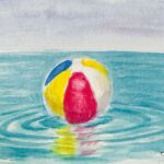 Watercolor Challenge: Beach BallsIn Weekly ChallengeJune 26, 2026